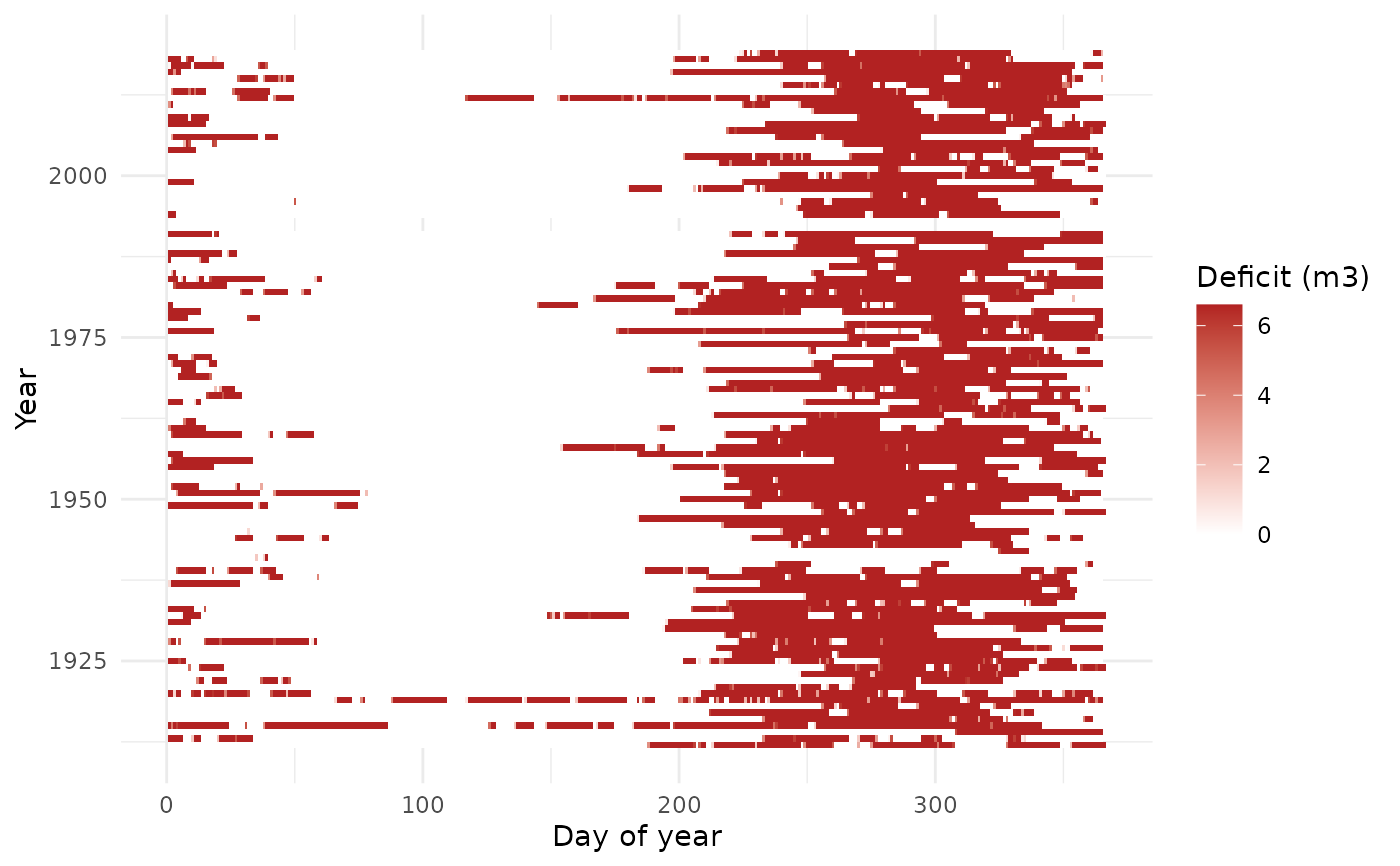
Heatmap of daily deficit by year (y) and day-of-year (x), showing when shortfalls occur and how they cluster in the dry season.
Examples
sim <- rh_simulate(precip_pi$value, demand = 6.6, area = 4170, capacity = 400,
                   runoff = 0.85, efficiency = 1)
if (requireNamespace("ggplot2", quietly = TRUE)) {
  rh_plot_failure_calendar(sim, dates = precip_pi$date)
}